Skip to main content
.us
Delivering to Lebanon 66952
Update location
Kindle Store
Select the department you want to search in
All Departments
Alexa Skills
Amazon Clinic
Amazon Devices
Amazon Fresh
Amazon Pharmacy
Amazon Warehouse
Appliances
Apps & Games
Arts, Crafts & Sewing
Audible Books & Originals
Automotive Parts & Accessories
Baby
Beauty & Personal Care
Books
CDs & Vinyl
Cell Phones & Accessories
Clothing, Shoes & Jewelry
Women
Men
Girls
Boys
Baby
Collectibles & Fine Art
Computers
Credit and Payment Cards
Digital Music
Electronics
Garden & Outdoor
Gift Cards
Grocery & Gourmet Food
Handmade
Health, Household & Baby Care
Home & Business Services
Home & Kitchen
Industrial & Scientific
Just for Prime
Kindle Store
Luggage & Travel Gear
Luxury Stores
Magazine Subscriptions
Movies & TV
Musical Instruments
Office Products
Pet Supplies
Premium Beauty
Prime Video
Smart Home
Software
Sports & Outdoors
Subscribe & Save
Subscription Boxes
Tools & Home Improvement
Toys & Games
Under $10
Video Games
Whole Foods Market
Search Amazon
EN
Hello, sign in
Account & Lists
Returns
& Orders
Cart
All
Disability Customer Support
Medical Care
Groceries
Best Sellers
Amazon Basics
New Releases
Prime
Music
Customer Service
Today's Deals
Amazon Home
Registry
Books
Pharmacy
Gift Cards
Luxury Stores
Smart Home
Fashion
Sell
Toys & Games
Find a Gift
Automotive
Computers
Coupons
Home Improvement
Beauty & Personal Care
Household, Health & Baby Care
Video Games
Pet Supplies
Sports & Outdoors
Works with Alexa
Memorial Day: up to 40% off
Buy a Kindle
Kindle eBooks
Kindle Unlimited
Prime Reading
Best Sellers & More
Categories
Kindle Vella
Amazon Book Clubs
Kindle Book Deals
Kindle Singles
Newsstand
Manage content and devices
Advanced Search
Your Company Bookshelf
Amazon Book Review
MOST RECENT
EDITORS' PICKS
CELEBRITY PICKS
INTERVIEWS
CELEBRITY PICKS
Stephen King’s favorite recent reads
by
Seira Wilson
|
May 20, 2024
EDITORS’ PICKS
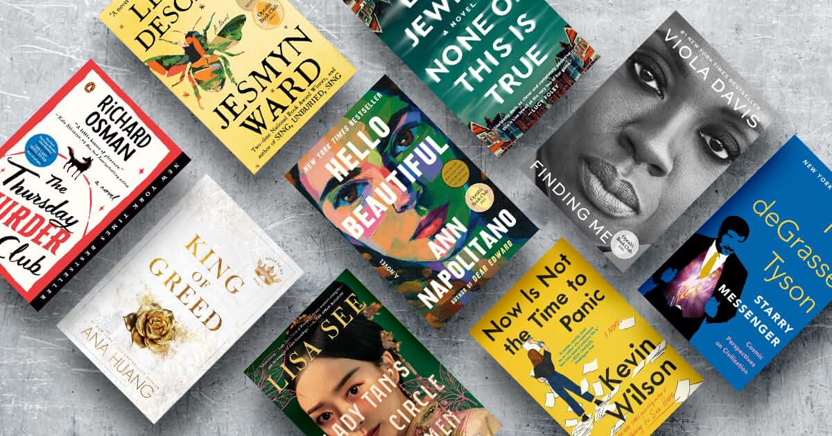
Amazon Book Sale: Final chance to read more and pay less with deals on Editors' Picks from Lisa Jewell, Ana Huang, Richard Osman, and many more
by
Vannessa Cronin
|
May 18, 2024
EDITORS’ PICKS
Best romance reads of May, as chosen by the Amazon Editors
by
Abby Abell
|
May 17, 2024
EDITORS’ PICKS
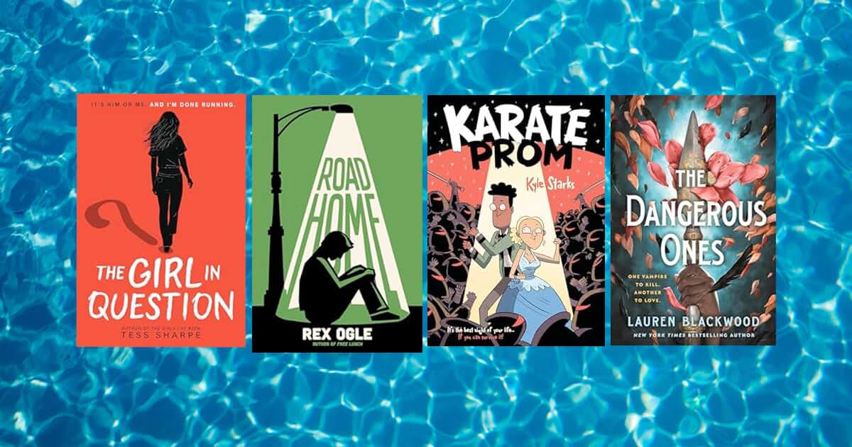
Best young adult books of May 2024, as chosen by the Amazon Editors
by
Seira Wilson
|
May 17, 2024
EDITORS’ PICKS
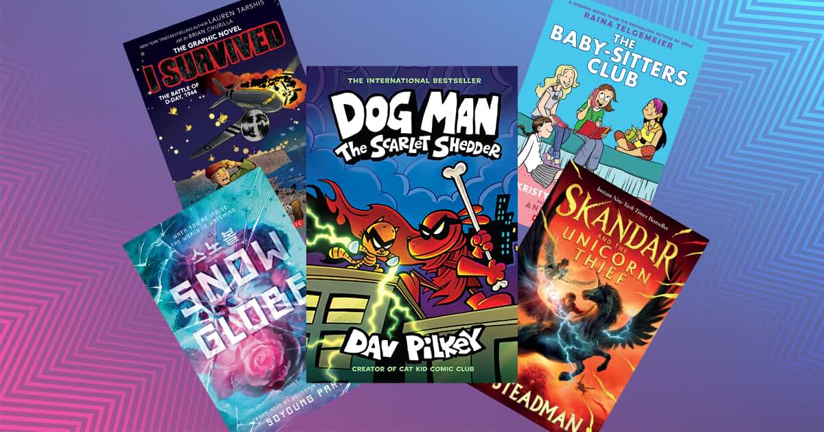
Great kids books to read this summer (or anytime)
by
Lindsay Powers
|
May 16, 2024
EDITORS’ PICKS
What to read next: a new book from Christina Lauren, ‘Erasure,’ ‘City of Girls,’ and more
by
Al Woodworth
|
May 15, 2024
CELEBRITY PICKS
Former FBI Director turned-thriller-writer James Comey on his favorite recent reads
by
Vannessa Cronin
|
May 14, 2024
CELEBRITY PICKS
Actress, comedian, and author of 'The Last Black Unicorn' Tiffany Haddish’s favorite recent reads
by
Vannessa Cronin
|
May 13, 2024
EDITORS’ PICKS
Best literature and fiction of May, as chosen by the Amazon Editors
by
Erin Kodicek
|
May 09, 2024
EDITORS’ PICKS
The best history books of May 2024, as chosen by the Amazon Editors
by
Lindsay Powers
|
May 09, 2024
EDITORS’ PICKS
What to read next: a genre-bending debut, an award-winning historical suspense, a Pulitzer-prize winning biography, and more
by
Abby Abell
|
May 08, 2024
EDITORS’ PICKS
Editors’ personal picks from the Best Books of May 2024
by
Seira Wilson
|
May 07, 2024
EDITORS’ PICKS
All the historical romances you need ahead of Bridgerton’s new season
by
Abby Abell
|
May 06, 2024
EDITORS’ PICKS
Best nonfiction books of May 2024, as chosen by the Amazon Editors
by
Lindsay Powers
|
May 03, 2024
INTERVIEW
Mary Kubica, author of April’s mystery book club pick, ‘She’s Not Sorry,’ answers our burning questions
by
Vannessa Cronin
|
May 03, 2024
EDITORS’ PICKS
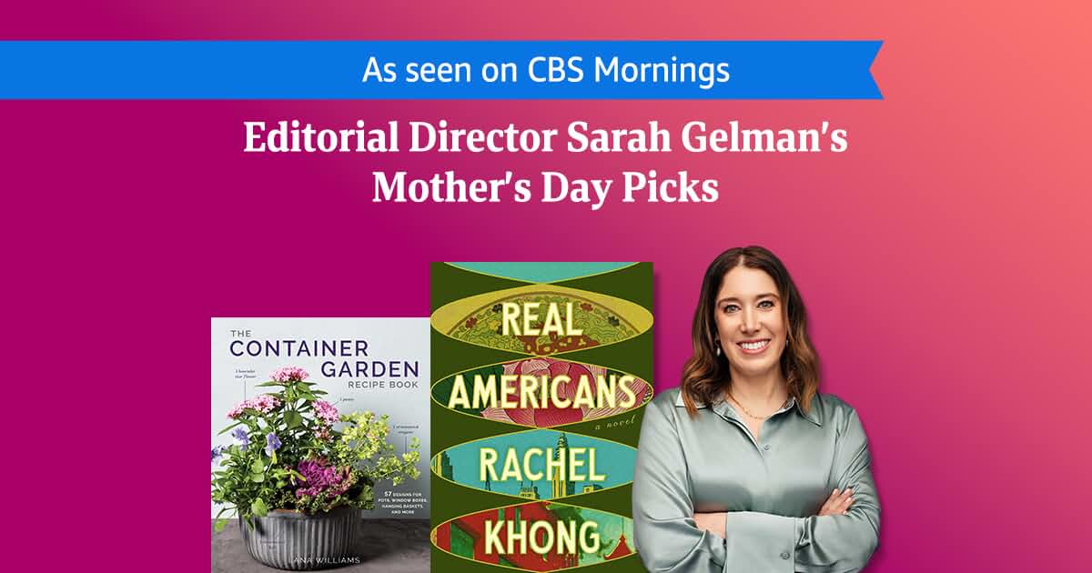
Editorial Director Sarah Gelman’s Mother’s Day picks, as seen on 'CBS Mornings'
by
Sarah Gelman
|
May 02, 2024
EDITORS’ PICKS
Best Books of May 2024, as chosen by the Amazon Editors
by
Erin Kodicek
|
May 01, 2024
EDITORS’ PICKS
What to Read Next: 'The Idea of You' and ‘We Were the Lucky Ones’ hit the screen, an NBA playoff read, and more
by
Vannessa Cronin
|
May 01, 2024
INTERVIEW
Ana Huang talks ‘Kings of Sin’ billionaire romance series, Booktok fame, and what’s next
by
Kami Tei
|
April 30, 2024
CELEBRITY PICKS
‘Demon of Unrest’ author Erik Larson: Book by Book
by
Lindsay Powers
|
April 29, 2024
←
Previous
1
2
3
...
Next
→
Back to top
Get to Know Us
Careers
Amazon Newsletter
About Amazon
Accessibility
Sustainability
Press Center
Investor Relations
Amazon Devices
Amazon Science
Make Money with Us
Sell on Amazon
Sell apps on Amazon
Supply to Amazon
Protect & Build Your Brand
Become an Affiliate
Become a Delivery Driver
Start a Package Delivery Business
Advertise Your Products
Self-Publish with Us
Become an Amazon Hub Partner
›
See More Ways to Make Money
Amazon Payment Products
Amazon Visa
Amazon Store Card
Amazon Secured Card
Amazon Business Card
Shop with Points
Credit Card Marketplace
Reload Your Balance
Gift Cards
Amazon Currency Converter
Let Us Help You
Your Account
Your Orders
Shipping Rates & Policies
Amazon Prime
Returns & Replacements
Manage Your Content and Devices
Recalls and Product Safety Alerts
Help
English
United States
Amazon Music
Stream millions
of songs
Amazon Ads
Reach customers
wherever they
spend their time
6pm
Score deals
on fashion brands
AbeBooks
Books, art
& collectibles
ACX
Audiobook Publishing
Made Easy
Sell on Amazon
Start a Selling Account
Amazon Business
Everything For
Your Business
Amazon Fresh
Groceries & More
Right To Your Door
AmazonGlobal
Ship Orders
Internationally
Home Services
Experienced Pros
Happiness Guarantee
Amazon Web Services
Scalable Cloud
Computing Services
Audible
Listen to Books & Original
Audio Performances
Box Office Mojo
Find Movie
Box Office Data
Goodreads
Book reviews
& recommendations
IMDb
Movies, TV
& Celebrities
IMDbPro
Get Info Entertainment
Professionals Need
Kindle Direct Publishing
Indie Digital & Print Publishing
Made Easy
Amazon Photos
Unlimited Photo Storage
Free With Prime
Prime Video Direct
Video Distribution
Made Easy
Shopbop
Designer
Fashion Brands
Amazon Warehouse
Great Deals on
Quality Used Products
Whole Foods Market
America’s Healthiest
Grocery Store
Woot!
Deals and
Shenanigans
Zappos
Shoes &
Clothing
Ring
Smart Home
Security Systems
eero WiFi
Stream 4K Video
in Every Room
Blink
Smart Security
for Every Home
Neighbors App
Real-Time Crime
& Safety Alerts
Amazon Subscription Boxes
Top subscription boxes – right to your door
PillPack
Pharmacy Simplified
Amazon Renewed
Like-new products
you can trust
Conditions of Use
Privacy Notice
Consumer Health Data Privacy Disclosure
Your Ads Privacy Choices
© 1996-2024, Amazon.com, Inc. or its affiliates